
Wednesday, September 5, 2012

Thursday, August 30, 2012

Wednesday, August 29, 2012

Again, Image Manipulation. We needed to create a movie poster utilizing the original type for the title and having five images integrated into the final image. This is actually an alternate version from what I turned in, adding the halo effect around the moon, widening the credits at the bottom, raising Mani (the guy with the axe,) and raising the title to fix a negative space issue I noticed. I prefer this one over the original, but I will post the original as soon as I can, so you can see the differences.
Update: The one on the left is the original I turned in. The one on the right is the revised version I did. I have to say the revised version works a lot better. The halo around the moon and repositioning of Mani balances out the image more and the credits running all along the bottom works much better.


 This is for an assignment in which we were to design a personal web page. The first image is an anagolous color scheme in the violet spectrum. The second is a complementary color scheme. The third is the final image I turned in for a grade which is another anagolous color scheme, this time in the red spectrum, but we had to add at least five images as well.
Out of curiosity I checked to see if that web address was being used and it is. Not sure if it is actually being updated and utilized, but I guess I'll have come up with something else for a personal site.

Thursday, July 26, 2012


Here's something that I threw together in my Image Manipulation class. I was supposed to make the front and back of a playing card showing a face card. I felt Wonder Woman is always deserving of respect and I like the idea of creating a deck of cards based on the DC universe, so I made it a DC deck as is seen from the back. I'm actually pretty happy with this. I really want to make the rest of the deck now...
Update: Yellow and blue is an alternate back. I like this one more actually. More Wonder Woman specific, but I think it looks better.

Wednesday, July 11, 2012


Okay so this is what I worked on during the Summer break. Not as much as I would have liked, but there it is.
My purpose in the first two was to start working on figuring out faces and what makes one face look different than another. I had to pay close attention to the shape of the eyes, mouth, nose, etc. and figure out the approximate proportions to the other objects on the face. All of these were taken from photo references of people. Bonus points to me if you can figure out who they are.
The next four are the cover and first three pages of a comic. I wanted to look at a comic book and take the composistion that was utilized by them and draw what I saw. I figure this will help me get used to the way that the lines are supposed to work in interpreting the humanoid form to a two dimensional format. Also I figured it would help me get comfortable with backgrounds and perspectives.
Thursday, June 14, 2012
Final Project (Revised)
 |
| The courageous young boy prepares a violent psychic attack against the hideous monster to save his terrified girlfriend. |
This is the final turn in for my Fundamentals of Design class based off of the critique I have received from the teacher.
 Okay, so here is something that I decided to experiment with. One of my teachers informed me that the method of my coloring and rendering is actually not the best way to be doing it. It was apparently what would be a crutch later on to achieve what I wanted "easier" than if I were to do it through the use of colors and adjusting the values and saturation of those colors based off of the light source. I figured I would try out the actual digital painting process and this is what I came up with. For reference this is the same Wonder Woman that shows up in the Four Favs post I have from earlier, just with the digital painting method utilized instead of my old way of doing it. I did cheat a bit on the background and used something that I found from World of Warcraft. I did remove the color from that picture and a few crystal spires that were in the picture, then added some color for the rooftops, the sky, the foliage on the hills and the waterfall. The bushes in the mid ground and the grass were made by using a brush set that I found somewhere. I apologize to the creator of the brush set for not giving proper recognition, but all I can remember is I found it through DeviantArt.
What I find the most amusing about this is that my teacher said the way I was doing this before was "a crutch" that I should avoid. That implies to me that it was an easier way to do what I need. In practice, however, I found that the digital painting was actually much easier to do than the method I had been using. I do like the fact that the colors blend SO much more smoothly with this method. I just need to continue practicing with it so that I can get the proper richness of color that I am looking for. I am sure it is simply because of the swatches that I chose but this picture seems a touch ashen to me. That may be a result of me paying attention to the color palette more and not using colors that are not web safe. I guess since those colors tend to be highly saturated, I am used to seeing my pictures with more saturation.
Tuesday, June 12, 2012

Final Project
 |
| The courageous young boy prepares a violent mental attack against the hideous monster to save his terrified girlfriend. |
Thursday, June 7, 2012


Tuesday, June 5, 2012


Thursday, May 31, 2012
Assignment 5
 |
| Sensing the horrific beast has passed, the frightened child comes out of hiding. |
 |
| As much as he struggles against it he is still overwhelmed by the mass of creatures. |
 |
| Raz prepares a mental attack against the giant, mutated lungfish, Linda, to rescue Lily. |
 |
| As Spyvo flees in terror from the beast, Syf and Nightshade laugh uproariously at the joke. |
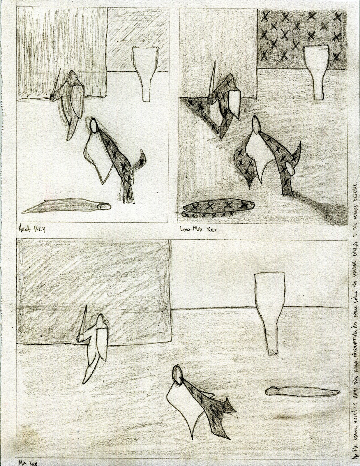 |
| The rogue violently kicks the mage, interupting his spell while the warrior charges to the mages' defense. |
Tuesday, May 29, 2012

Sunday, May 27, 2012


Thursday, May 24, 2012
Assignment 3

 |
| Sudden Attack in the Wilderness |

 |
| Death at the Endof a Journey |

 |
| Persevering Against Overwhelming Odds |

 |
| Priestess Praying for Beneficial Things for her People |
 | |
| A King Contemplating Dark Times for His Kingdom |
 |
| A King Contemplating Dark Time for His Kingdom (Reworked) |

Subscribe to:
Comments (Atom)